3 Ways to Increase Website Conversion
Getting a web visitor to take action is the main objective of any web page. Unfortunately, many businesses see still a website as a brochure and do not take into account the way that web usage has changed and what the real purpose is. They spend all their time on design and not enough on usability and website conversion optimization. Pretty is good but conversion grows a business.
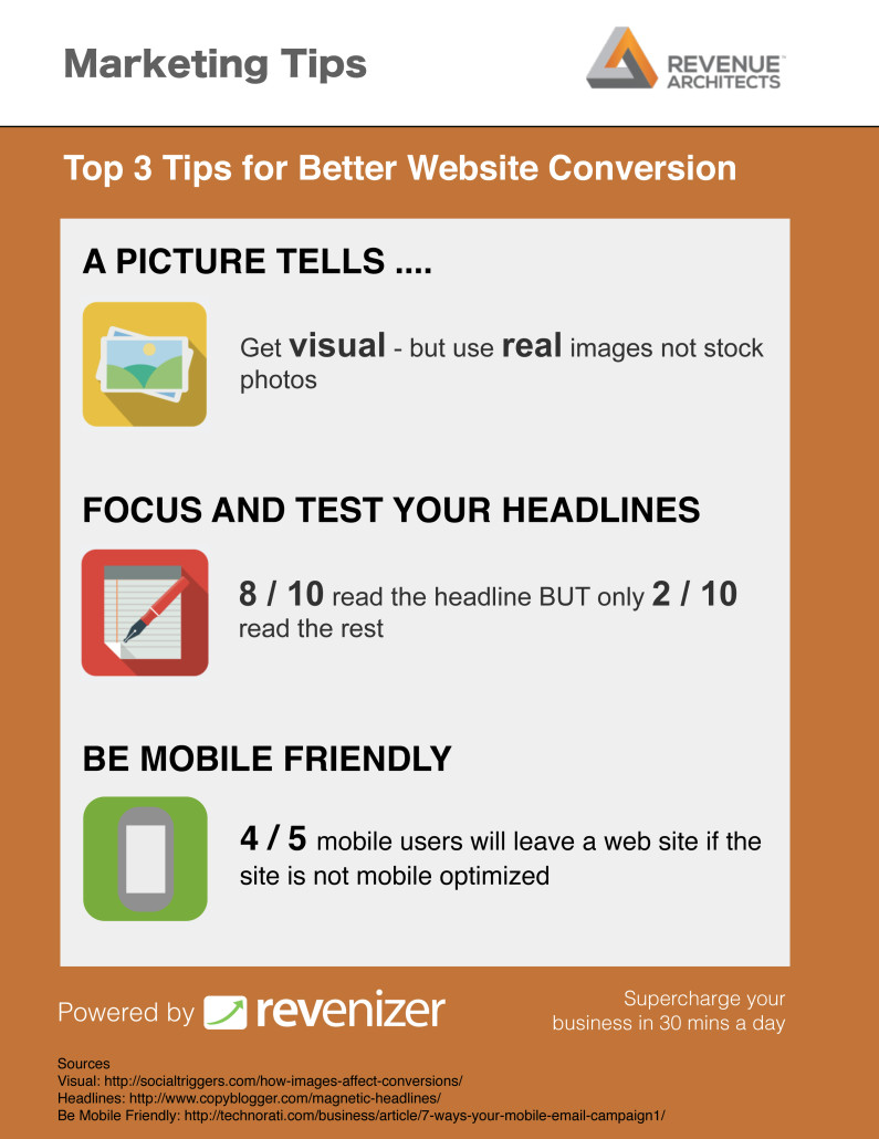
1. Use of Strong Visuals
Images need to have a purpose not just be decoration. Derek Halpen at Social Triggers put together a great article on the effective use of images.
He pointed out the following potential reasons for using images.
-To show a key product or service feature
Derek points out how genius the image of Apple Air in the envelope is. Apple is selling the “thinness” feature and nail it with the image. If you are selling a service, a good graphic can explain your offer.

-To direct attention
Images can be used to direct the web visitor’s attention. Images of people looking at or pointing can emphasize a key headline or call-to-action like a sign up form.
-To build trust
Using pictures of real people involved in the business whether they are customers or team members builds trust. Derek points out that people want to deal with real people. Stock images just don’t cut it. Customer testimonials have a lot more credibility if they have an image of the customer with them.
2. Get the Headline Right
Another key page element is the headline. Copyblogger found 8 out of 10 people read only the headline. The promise of the headline must be compelling enough to turn a browser into a reader and then a sign up. Copyblogger offer a 11 part course to help with this. You won’t get the headline right first time. Optimizely lets you to test different headlines (and images) with no coding required. Testing should be an ongoing process.
3. Be Mobile Friendly
The big movement right now is towards responsive design. This means that a web site will reconfigure to be usable for any device from laptop ti smart phone. Website builders from Virb to Wix and Squarespace now offer responsive solutions. Excellent responsive themes are available for WordPress.
 Despite this, only 6% of small business websites are mobile ready according to a recent survey. The same study calculated that the lack of mobile readiness is costing US small businesses $1T each year. Mobile is now 28% of all web traffic. 4 out of 5 of these visitors will leave a site if it is not mobile optimized.
Make sure your emails are mobile optimized also. 70% of users will delete an email if it does display well on their smartphone. 75% of users open emails on smart phones.
Looking for help with improving conversion. Contact us at Revenue Architects.
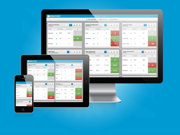
For more ideas, go to Revenizer for 400+ more tips on optimizing digital + real time stats on your marketing performance.
The article summary is below.


Leave a Reply
Want to join the discussion?Feel free to contribute!