Conversion Killers: 5 UX Myths Stalling Your Revenue Engine
The Cost of the ‘Build It and They Will Come’ Delusion
In high-consideration B2B, a “pretty” website is no longer enough. If your Revenue Platform (Layer II) ignores User Experience (UX), your prospective clients will bounce off your pages like ping-pong balls. With the rise of Agentic Search and ultra-high mobile expectations, the friction caused by “guessing” at design is a direct tax on your ROI. Are you still operating under these five dangerous UX misconceptions?
UX Myth #5: Users Don’t Scroll
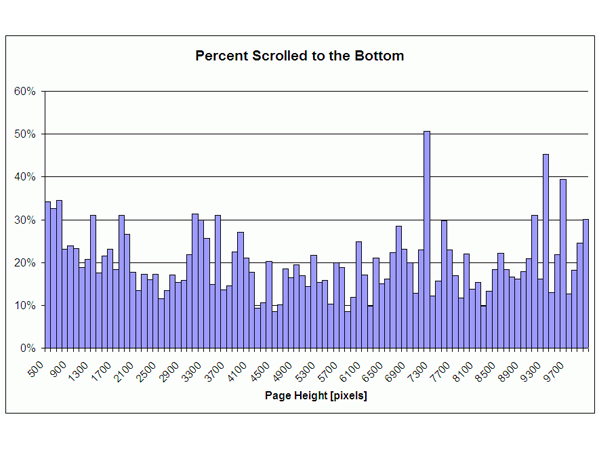
While “above-the-fold” content must be compelling to establish your Value Positioning (PB2), users are more conditioned to scroll than ever. A well-structured page with a clear “information scent” encourages deep engagement. Studies show that 76% of users scroll, and a significant portion will reach the bottom regardless of length if the narrative builds value.
Best Practices
- Prioritize a “Hook” above the fold that promises a reward for scrolling.
- Use a continuous vertical flow to guide the user through the Pain Ladder.
- Provide a high-value “takeaway” or a clear CTA at the footer.
UX Myth #4: The Three-Click Rule
It’s not the number of clicks; it’s the Logic Flow. If each click provides clear progress toward a goal, users do not get frustrated. In fact, clear labeling can improve usability by 600%. In RAOS, we focus on the “Path of Least Resistance”—ensuring each click aligns with the buyer’s Moment of Readiness.
Best Practices
- Use self-explanatory, “engineered” button text (e.g., “Download Friction Report” vs. “Submit”).
- Ensure each interaction clearly leads the user closer to their Object of Desire.
UX Myth #3: People Read Web Pages
They don’t. They scan. Users read less than 20% of the text on a page, looking for “pertinent nuggets.” In 2026, your content must be Agent-Readable and Human-Scannable. If your value is buried in a wall of text, it effectively doesn’t exist.
Best Practices
- Use descriptive H2 and H3 headings to tell the story for scanners.
- Keep core copy concise—aim for high impact in the top 50% of the page.
- Use bulleted lists to break down complex GTM Architecture concepts.
UX Myth #2: You Are the User
The “Curse of Knowledge” is a major revenue killer. Designing for yourself leads to a platform that makes sense to you, but confuses your target market. High-performance design is about Empathy Engineering—building for the specific Audience Value (AVP) of your segment.
Best Practices
- Test your designs against actual personas in your Market Definition (PB1).
- Balance aesthetics with One-Handed Usability for mobile-first executives.
UX Myth #1: Testing is Too Expensive
What’s expensive is a platform that doesn’t convert. Usability Testing can be fast and lean. Just 3-5 participants can identify 80% of your most glaring friction points. In the RAOS model, we use A/B Wireframes and Digital Experience Indices to ensure your investment is protected before a single line of code is written.
Best Practices
- Recruit a few loyal customers to provide feedback on new Revenue Programs (Layer III).
- Use click-through prototypes to test Logic Flows early and often.
Architecture Over Intuition
Without user research, your design decisions are just expensive guesses. Protect your Revenue Platform by using informed, experienced architects who implement UX best practices. Stop building pages and start building Paths to Value.
Is your website a friction point? Contact Revenue Architects today for a Digital Experience Index and see how your UX stacks up against the competition.


Leave a Reply
Want to join the discussion?Feel free to contribute!